
Flutter for OpenHarmony 实战之基础组件:第一篇 Container 容器组件完全指南
Flutter for OpenHarmony 实战之基础组件:第一篇 Container 容器组件完全指南
前言
在 Flutter for OpenHarmony 开发中, 本文你将学到: 首先在项目根路径下,创建 将 widgets 为组件目录,该目录下防止我们编写可复用的组件,当然你也可以将其更改为 components 或者其他的名称亦可。 编辑 Container 实际上是多个基础 Widget 的组合,理解这一点有助于优化性能: 这块设计起到其他一些组件,类似 CSS 中的属性,不必着急,后续我们会陆续讲到。 💡 性能提示:如果只需要单一功能(如仅需要内边距),建议直接使用 Container 提供了多种控制尺寸的方式: 理解 EdgeInsets 常用构造方法: ⚠️ 注意: 使用 BoxDecoration 是 Container 最强大的特性之一,可以实现丰富的视觉效果。 阴影是提升 UI 层次感的重要手段: OpenHarmony 设备分辨率跨度极大(720×1280 ~ 3840×2160),直接使用硬编码像素值会导致: ❌ 反面示例: ✅ 正确做法: 📌 提示:在 OpenHarmony 设备测试时,建议使用多种分辨率验证布局效果。 综合运用以上知识,构建一个精美的卡片组件: 本文详细介绍了 Container 组件的核心用法: 📦 完整代码已上传至 AtomGit:open-harmony-example 🌐 欢迎加入开源鸿蒙跨平台社区:开源鸿蒙跨平台开发者社区Container 是构建 UI 界面的基石组件。它类似于 Web 开发中的
一、Container 基础概念
1.1 什么是 Container
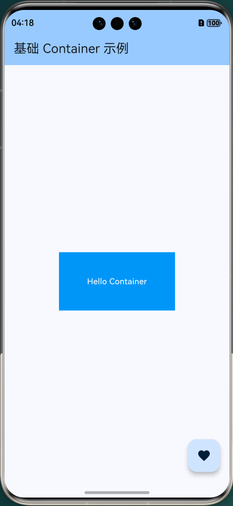
Container 是 Flutter 中一个组合型 Widget,它将多个单一功能的 Widget 封装在一起,提供了便捷的一站式布局解决方案。lib/widgets/basic_container_example.dart。
import 'package:flutter/material.dart';
/// 最简单的 Container 示例
class BasicContainerExample extends StatelessWidget {
const BasicContainerExample({super.key});
Widget build(BuildContext context) {
return Container(
width: 200, // 宽度
height: 100, // 高度
color: Colors.blue, // 背景色
child: const Center(
child: Text(
'Hello Container',
style: TextStyle(color: Colors.white),
),
),
);
}
}
lib/main.dart,内容如下:import 'package:flutter/material.dart';
import 'widgets/basic_container_example.dart';
/// 应用入口函数
void main() {
// 运行 Flutter 应用
runApp(const MyApp());
}
/// 根 Widget - 应用程序的顶层组件
class MyApp extends StatelessWidget {
const MyApp({super.key});
Widget build(BuildContext context) {
return MaterialApp(
title: 'Flutter for OpenHarmony', // 应用标题
debugShowCheckedModeBanner: false, // 隐藏调试标签
theme: ThemeData(
// 主题配置
colorScheme: ColorScheme.fromSeed(seedColor: Colors.blue),
useMaterial3: true, // 使用 Material 3 设计
),
// 使用命名路由管理页面
initialRoute: '/',
home: const HomePage(),
);
}
}
/// 首页 Widget
class HomePage extends StatelessWidget {
const HomePage({super.key});
Widget build(BuildContext context) {
return Scaffold(
// 应用栏
appBar: AppBar(
title: const Text('基础 Container 示例'),
backgroundColor: Theme.of(context).colorScheme.inversePrimary,
),
// 页面主体
body: Center(
child: Column(
mainAxisAlignment: MainAxisAlignment.center,
children: [
const BasicContainerExample(),
],
),
),
// 悬浮按钮
floatingActionButton: FloatingActionButton(
onPressed: () {
// 显示提示
ScaffoldMessenger.of(context).showSnackBar(
const SnackBar(content: Text('Flutter + OpenHarmony = ❤️')),
);
},
child: const Icon(Icons.favorite),
),
);
}
}
1.2 Container 的内部组成
// Container 内部实现原理(简化版)
// 等价于以下 Widget 的嵌套组合:
Widget buildContainer() {
Widget current = child;
// 1. 对齐
if (alignment != null) {
current = Align(alignment: alignment, child: current);
}
// 2. 内填充
if (padding != null) {
current = Padding(padding: padding, child: current);
}
// 3. 装饰(背景、边框、阴影等)
if (decoration != null) {
current = DecoratedBox(decoration: decoration, child: current);
}
// 4. 尺寸约束
if (constraints != null) {
current = ConstrainedBox(constraints: constraints, child: current);
}
// 5. 外边距
if (margin != null) {
current = Padding(padding: margin, child: current);
}
// 6. 变换
if (transform != null) {
current = Transform(transform: transform, child: current);
}
return current;
}
Padding 而非 Container,这样可以减少 Widget 树的深度。
二、核心属性详解
2.1 尺寸控制
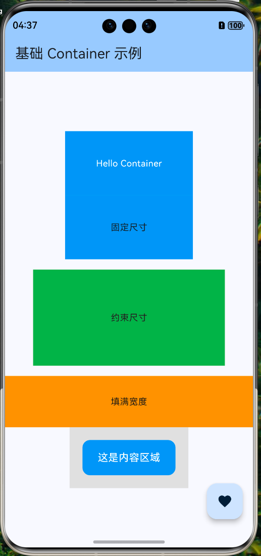
widgets/size_control_example.dartimport 'package:flutter/material.dart';
/// 尺寸控制示例
class SizeControlExample extends StatelessWidget {
const SizeControlExample({super.key});
Widget build(BuildContext context) {
return Column(
children: [
// 方式一:固定宽高
Container(
width: 200, // 固定宽度 200 像素
height: 100, // 固定高度 100 像素
color: Colors.blue,
child: const Center(child: Text('固定尺寸')),
),
const SizedBox(height: 16),
// 方式二:使用约束(更灵活)
Container(
constraints: const BoxConstraints(
minWidth: 100, // 最小宽度
maxWidth: 300, // 最大宽度
minHeight: 50, // 最小高度
maxHeight: 150, // 最大高度
),
color: Colors.green,
child: const Center(child: Text('约束尺寸')),
),
const SizedBox(height: 16),
// 方式三:填满父容器
Container(
width: double.infinity, // 填满可用宽度
height: 80,
color: Colors.orange,
child: const Center(child: Text('填满宽度')),
),
],
);
}
}
2.2 边距与填充
margin(外边距)和 padding(内填充)的区别是掌握布局的关键:widgets/margin_padding_example.dart/// 边距与填充示例
class MarginPaddingExample extends StatelessWidget {
const MarginPaddingExample({super.key});
Widget build(BuildContext context) {
return Container(
color: Colors.grey[300], // 外层背景(用于显示 margin 效果)
child: Container(
// 外边距:影响与周围元素的间距
margin: const EdgeInsets.all(20),
// 内填充:影响子组件的位置
padding: const EdgeInsets.symmetric(
horizontal: 24, // 水平方向 24 像素
vertical: 16, // 垂直方向 16 像素
),
decoration: BoxDecoration(
color: Colors.blue,
borderRadius: BorderRadius.circular(12),
),
child: const Text(
'这是内容区域',
style: TextStyle(color: Colors.white, fontSize: 16),
),
),
);
}
}
// 四周相同边距
EdgeInsets.all(16)
// 分别指定上下左右
EdgeInsets.only(top: 8, left: 16, right: 16, bottom: 8)
// 对称边距(水平/垂直)
EdgeInsets.symmetric(horizontal: 24, vertical: 12)
// 从左上右下顺序指定(类似 CSS)
EdgeInsets.fromLTRB(16, 8, 16, 8)
margin 是外边距,控制 Container 与外部元素的间距;padding 是内填充,控制 Container 内部内容与边框的间距。2.3 对齐方式
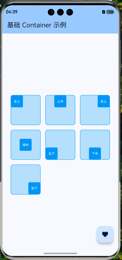
alignment 属性控制子组件在 Container 内的对齐位置:widgets/alignment_example.dart/// 对齐方式示例
class AlignmentExample extends StatelessWidget {
const AlignmentExample({super.key});
Widget build(BuildContext context) {
return Wrap(
spacing: 16,
runSpacing: 16,
children: [
// 左上角对齐
_buildAlignedContainer(Alignment.topLeft, '左上'),
// 顶部居中
_buildAlignedContainer(Alignment.topCenter, '上中'),
// 右上角对齐
_buildAlignedContainer(Alignment.topRight, '右上'),
// 居中对齐
_buildAlignedContainer(Alignment.center, '居中'),
// 左下角对齐
_buildAlignedContainer(Alignment.bottomLeft, '左下'),
// 底部居中
_buildAlignedContainer(Alignment.bottomCenter, '下中'),
// 右下角对齐
_buildAlignedContainer(Alignment.bottomRight, '右下'),
],
);
}
Widget _buildAlignedContainer(Alignment alignment, String label) {
return Container(
width: 100,
height: 100,
alignment: alignment, // 设置对齐方式
decoration: BoxDecoration(
color: Colors.blue[100],
border: Border.all(color: Colors.blue),
borderRadius: BorderRadius.circular(8),
),
child: Container(
width: 40,
height: 40,
decoration: BoxDecoration(
color: Colors.blue,
borderRadius: BorderRadius.circular(4),
),
child: Center(
child: Text(
label,
style: const TextStyle(color: Colors.white, fontSize: 10),
),
),
),
);
}
}
三、BoxDecoration 装饰器
3.1 背景色与渐变
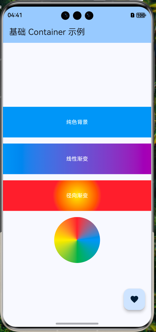
widgets/background_example.dart/// 背景色与渐变示例
class BackgroundExample extends StatelessWidget {
const BackgroundExample({super.key});
Widget build(BuildContext context) {
return Column(
children: [
// 纯色背景
Container(
width: double.infinity,
height: 80,
decoration: const BoxDecoration(
color: Colors.blue,
),
child: const Center(
child: Text('纯色背景', style: TextStyle(color: Colors.white)),
),
),
const SizedBox(height: 16),
// 线性渐变
Container(
width: double.infinity,
height: 80,
decoration: const BoxDecoration(
gradient: LinearGradient(
colors: [Colors.blue, Colors.purple],
begin: Alignment.centerLeft,
end: Alignment.centerRight,
),
),
child: const Center(
child: Text('线性渐变', style: TextStyle(color: Colors.white)),
),
),
const SizedBox(height: 16),
// 径向渐变
Container(
width: double.infinity,
height: 80,
decoration: const BoxDecoration(
gradient: RadialGradient(
colors: [Colors.yellow, Colors.orange, Colors.red],
center: Alignment.center,
radius: 0.8,
),
),
child: const Center(
child: Text('径向渐变', style: TextStyle(color: Colors.white)),
),
),
const SizedBox(height: 16),
// 扫描渐变(类似雷达扫描效果)
Container(
width: 120,
height: 120,
decoration: const BoxDecoration(
shape: BoxShape.circle,
gradient: SweepGradient(
colors: [Colors.blue, Colors.green, Colors.yellow, Colors.red, Colors.blue],
),
),
),
],
);
}
}
3.2 圆角与边框
widgets/border_radius_example.dart/// 圆角与边框示例
class BorderRadiusExample extends StatelessWidget {
const BorderRadiusExample({super.key});
Widget build(BuildContext context) {
return Wrap(
spacing: 16,
runSpacing: 16,
children: [
// 统一圆角
Container(
width: 100,
height: 100,
decoration: BoxDecoration(
color: Colors.blue,
borderRadius: BorderRadius.circular(16), // 四角统一圆角
),
child: const Center(
child: Text('圆角', style: TextStyle(color: Colors.white)),
),
),
// 不同方向的圆角
Container(
width: 100,
height: 100,
decoration: const BoxDecoration(
color: Colors.green,
borderRadius: BorderRadius.only(
topLeft: Radius.circular(24), // 左上大圆角
topRight: Radius.circular(24), // 右上大圆角
bottomLeft: Radius.circular(0), // 左下直角
bottomRight: Radius.circular(0), // 右下直角
),
),
child: const Center(
child: Text('部分圆角', style: TextStyle(color: Colors.white)),
),
),
// 圆形
Container(
width: 100,
height: 100,
decoration: const BoxDecoration(
color: Colors.orange,
shape: BoxShape.circle, // 圆形
),
child: const Center(
child: Text('圆形', style: TextStyle(color: Colors.white)),
),
),
// 边框
Container(
width: 100,
height: 100,
decoration: BoxDecoration(
color: Colors.white,
borderRadius: BorderRadius.circular(12),
border: Border.all(
color: Colors.blue,
width: 2,
),
),
child: const Center(
child: Text('边框', style: TextStyle(color: Colors.blue)),
),
),
// 虚线边框效果(使用多层边框模拟)
Container(
width: 100,
height: 100,
decoration: BoxDecoration(
color: Colors.grey[100],
borderRadius: BorderRadius.circular(12),
border: Border.all(
color: Colors.grey,
width: 1,
),
),
child: const Center(
child: Text('灰色边框', style: TextStyle(color: Colors.grey)),
),
),
],
);
}
}

3.3 阴影效果
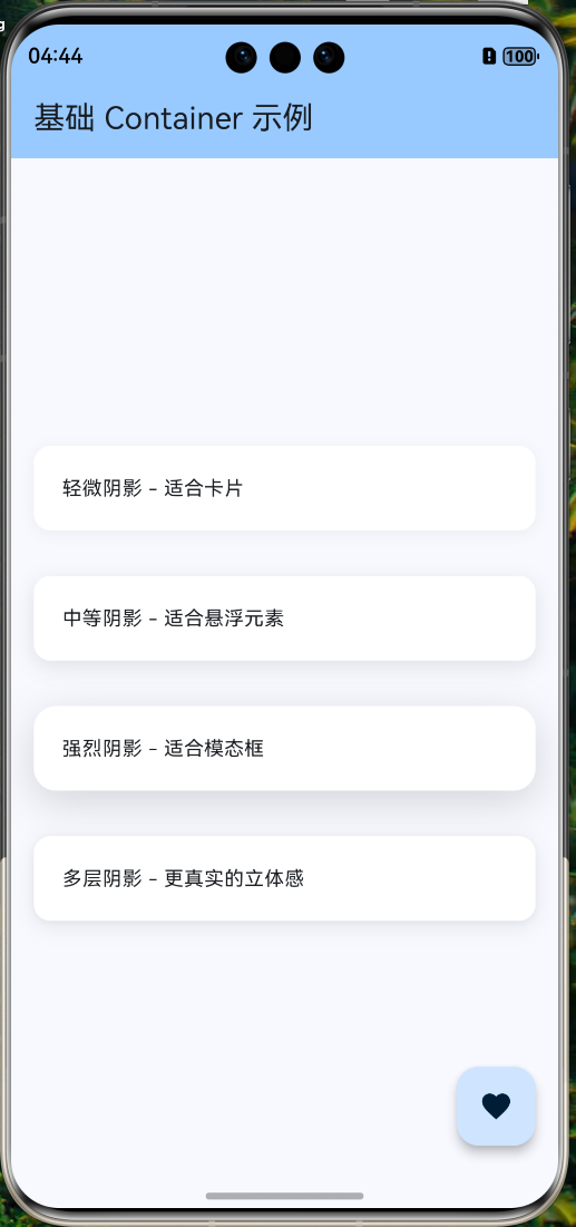
widgets/shadow_example.dart/// 阴影效果示例
class ShadowExample extends StatelessWidget {
const ShadowExample({super.key});
Widget build(BuildContext context) {
return Column(
children: [
// 轻微阴影(适合卡片)
Container(
width: double.infinity,
padding: const EdgeInsets.all(20),
margin: const EdgeInsets.all(16),
decoration: BoxDecoration(
color: Colors.white,
borderRadius: BorderRadius.circular(12),
boxShadow: [
BoxShadow(
color: Colors.black.withOpacity(0.05), // 阴影颜色
offset: const Offset(0, 2), // 偏移量
blurRadius: 8, // 模糊半径
spreadRadius: 0, // 扩散半径
),
],
),
child: const Text('轻微阴影 - 适合卡片'),
),
// 中等阴影(适合悬浮元素)
Container(
width: double.infinity,
padding: const EdgeInsets.all(20),
margin: const EdgeInsets.all(16),
decoration: BoxDecoration(
color: Colors.white,
borderRadius: BorderRadius.circular(12),
boxShadow: [
BoxShadow(
color: Colors.black.withOpacity(0.1),
offset: const Offset(0, 4),
blurRadius: 12,
spreadRadius: 0,
),
],
),
child: const Text('中等阴影 - 适合悬浮元素'),
),
// 强烈阴影(适合模态框)
Container(
width: double.infinity,
padding: const EdgeInsets.all(20),
margin: const EdgeInsets.all(16),
decoration: BoxDecoration(
color: Colors.white,
borderRadius: BorderRadius.circular(16),
boxShadow: [
BoxShadow(
color: Colors.black.withOpacity(0.15),
offset: const Offset(0, 8),
blurRadius: 24,
spreadRadius: 0,
),
],
),
child: const Text('强烈阴影 - 适合模态框'),
),
// 多层阴影(更真实的立体感)
Container(
width: double.infinity,
padding: const EdgeInsets.all(20),
margin: const EdgeInsets.all(16),
decoration: BoxDecoration(
color: Colors.white,
borderRadius: BorderRadius.circular(12),
boxShadow: [
// 第一层:轻微扩散
BoxShadow(
color: Colors.black.withOpacity(0.04),
offset: const Offset(0, 1),
blurRadius: 3,
spreadRadius: 0,
),
// 第二层:主阴影
BoxShadow(
color: Colors.black.withOpacity(0.08),
offset: const Offset(0, 4),
blurRadius: 12,
spreadRadius: 0,
),
],
),
child: const Text('多层阴影 - 更真实的立体感'),
),
],
);
}
}
四、OpenHarmony 平台适配
4.1 多分辨率适配
// 硬编码像素值,在不同设备上效果差异大
Container(
width: 300, // 在小屏设备可能溢出
height: 200, // 在大屏设备显得太小
child: YourWidget(),
)
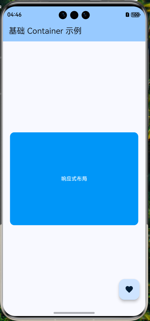
/// 响应式尺寸适配示例
class ResponsiveSizeExample extends StatelessWidget {
const ResponsiveSizeExample({super.key});
Widget build(BuildContext context) {
// 获取屏幕尺寸
final screenWidth = MediaQuery.of(context).size.width;
final screenHeight = MediaQuery.of(context).size.height;
return Container(
// 使用屏幕比例计算尺寸
width: screenWidth * 0.9, // 屏幕宽度的 90%
height: screenHeight * 0.3, // 屏幕高度的 30%
// 动态计算内边距
padding: EdgeInsets.symmetric(
horizontal: screenWidth * 0.05, // 水平边距为屏幕宽度的 5%
vertical: 16,
),
decoration: BoxDecoration(
color: Colors.blue,
borderRadius: BorderRadius.circular(
screenWidth * 0.03, // 圆角也可以根据屏幕动态计算
),
),
child: const Center(
child: Text(
'响应式布局',
style: TextStyle(color: Colors.white),
),
),
);
}
}
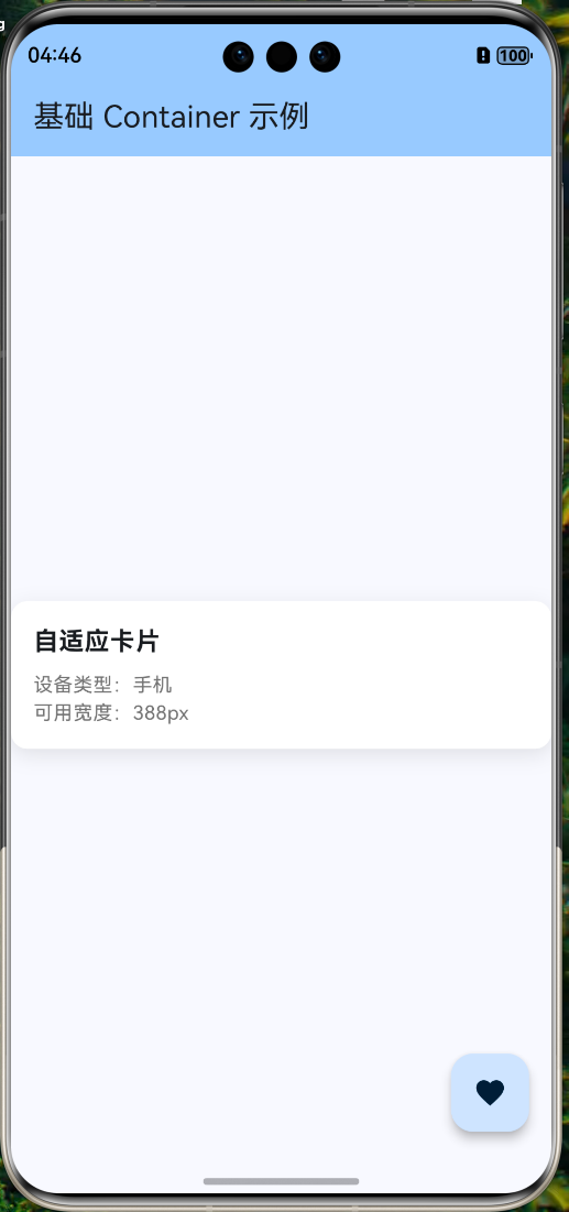
4.2 使用 LayoutBuilder 动态布局
/// 使用 LayoutBuilder 实现自适应布局
class AdaptiveLayoutExample extends StatelessWidget {
const AdaptiveLayoutExample({super.key});
Widget build(BuildContext context) {
return LayoutBuilder(
builder: (context, constraints) {
// 根据可用宽度判断设备类型
final isTablet = constraints.maxWidth > 600;
final isDesktop = constraints.maxWidth > 1024;
return Container(
// 根据设备类型调整宽度
width: isDesktop
? 800
: isTablet
? constraints.maxWidth * 0.8
: constraints.maxWidth,
// 根据设备类型调整边距
padding: EdgeInsets.all(isTablet ? 32 : 16),
// 根据设备类型调整圆角
decoration: BoxDecoration(
color: Colors.white,
borderRadius: BorderRadius.circular(isTablet ? 24 : 12),
boxShadow: [
BoxShadow(
color: Colors.black.withOpacity(0.1),
blurRadius: isTablet ? 24 : 12,
offset: Offset(0, isTablet ? 8 : 4),
),
],
),
child: Column(
crossAxisAlignment: CrossAxisAlignment.start,
children: [
Text(
'自适应卡片',
style: TextStyle(
fontSize: isTablet ? 24 : 18,
fontWeight: FontWeight.bold,
),
),
const SizedBox(height: 8),
Text(
'设备类型:${isDesktop ? "桌面" : isTablet ? "平板" : "手机"}',
style: TextStyle(
fontSize: isTablet ? 16 : 14,
color: Colors.grey[600],
),
),
Text(
'可用宽度:${constraints.maxWidth.toStringAsFixed(0)}px',
style: TextStyle(
fontSize: isTablet ? 16 : 14,
color: Colors.grey[600],
),
),
],
),
);
},
);
}
}
4.3 刘海屏适配
/// 刘海屏安全区域适配
class SafeAreaExample extends StatelessWidget {
const SafeAreaExample({super.key});
Widget build(BuildContext context) {
// 获取安全区域边距
final padding = MediaQuery.of(context).padding;
return Container(
// 考虑安全区域的顶部边距
margin: EdgeInsets.only(
top: padding.top + 16, // 刘海区域 + 额外边距
left: 16,
right: 16,
bottom: padding.bottom + 16, // 底部安全区域 + 额外边距
),
padding: const EdgeInsets.all(20),
decoration: BoxDecoration(
color: Colors.white,
borderRadius: BorderRadius.circular(16),
boxShadow: [
BoxShadow(
color: Colors.black.withOpacity(0.1),
blurRadius: 12,
offset: const Offset(0, 4),
),
],
),
child: Column(
crossAxisAlignment: CrossAxisAlignment.start,
children: [
const Text(
'安全区域适配',
style: TextStyle(fontSize: 20, fontWeight: FontWeight.bold),
),
const SizedBox(height: 8),
Text('顶部安全区域:${padding.top.toStringAsFixed(1)}px'),
Text('底部安全区域:${padding.bottom.toStringAsFixed(1)}px'),
Text('左侧安全区域:${padding.left.toStringAsFixed(1)}px'),
Text('右侧安全区域:${padding.right.toStringAsFixed(1)}px'),
],
),
);
}
}
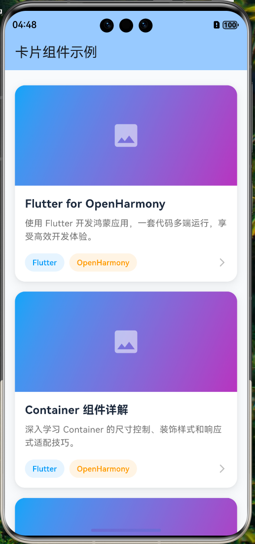
五、实战案例:精美卡片组件
import 'package:flutter/material.dart';
/// 精美卡片组件
class BeautifulCard extends StatelessWidget {
final String title;
final String subtitle;
final String imageUrl;
final VoidCallback? onTap;
const BeautifulCard({
super.key,
required this.title,
required this.subtitle,
required this.imageUrl,
this.onTap,
});
Widget build(BuildContext context) {
return GestureDetector(
onTap: onTap,
child: Container(
margin: const EdgeInsets.symmetric(horizontal: 16, vertical: 8),
decoration: BoxDecoration(
color: Colors.white,
borderRadius: BorderRadius.circular(16),
boxShadow: [
// 多层阴影,营造立体感
BoxShadow(
color: Colors.black.withOpacity(0.04),
offset: const Offset(0, 1),
blurRadius: 3,
),
BoxShadow(
color: Colors.black.withOpacity(0.08),
offset: const Offset(0, 4),
blurRadius: 12,
),
],
),
child: ClipRRect(
borderRadius: BorderRadius.circular(16),
child: Column(
crossAxisAlignment: CrossAxisAlignment.start,
children: [
// 图片区域
Container(
height: 160,
width: double.infinity,
decoration: BoxDecoration(
gradient: LinearGradient(
colors: [Colors.blue.shade400, Colors.purple.shade400],
begin: Alignment.topLeft,
end: Alignment.bottomRight,
),
),
child: const Center(
child: Icon(
Icons.image,
size: 48,
color: Colors.white54,
),
),
),
// 内容区域
Container(
padding: const EdgeInsets.all(16),
child: Column(
crossAxisAlignment: CrossAxisAlignment.start,
children: [
// 标题
Text(
title,
style: const TextStyle(
fontSize: 18,
fontWeight: FontWeight.bold,
color: Color(0xFF1E293B),
),
),
const SizedBox(height: 8),
// 副标题
Text(
subtitle,
style: TextStyle(
fontSize: 14,
color: Colors.grey[600],
height: 1.5,
),
maxLines: 2,
overflow: TextOverflow.ellipsis,
),
const SizedBox(height: 16),
// 底部操作区
Row(
children: [
// 标签
Container(
padding: const EdgeInsets.symmetric(
horizontal: 12,
vertical: 6,
),
decoration: BoxDecoration(
color: Colors.blue.withOpacity(0.1),
borderRadius: BorderRadius.circular(20),
),
child: const Text(
'Flutter',
style: TextStyle(
fontSize: 12,
color: Colors.blue,
fontWeight: FontWeight.w500,
),
),
),
const SizedBox(width: 8),
Container(
padding: const EdgeInsets.symmetric(
horizontal: 12,
vertical: 6,
),
decoration: BoxDecoration(
color: Colors.orange.withOpacity(0.1),
borderRadius: BorderRadius.circular(20),
),
child: const Text(
'OpenHarmony',
style: TextStyle(
fontSize: 12,
color: Colors.orange,
fontWeight: FontWeight.w500,
),
),
),
const Spacer(),
// 箭头图标
Icon(
Icons.arrow_forward_ios,
size: 16,
color: Colors.grey[400],
),
],
),
],
),
),
],
),
),
),
);
}
}
/// 使用示例
class CardDemoPage extends StatelessWidget {
const CardDemoPage({super.key});
Widget build(BuildContext context) {
return Scaffold(
appBar: AppBar(
title: const Text('卡片组件示例'),
backgroundColor: Theme.of(context).colorScheme.inversePrimary,
),
backgroundColor: const Color(0xFFF8FAFC),
body: ListView(
padding: const EdgeInsets.symmetric(vertical: 16),
children: [
BeautifulCard(
title: 'Flutter for OpenHarmony',
subtitle: '使用 Flutter 开发鸿蒙应用,一套代码多端运行,享受高效开发体验。',
imageUrl: '',
onTap: () {
// 处理点击事件
},
),
BeautifulCard(
title: 'Container 组件详解',
subtitle: '深入学习 Container 的尺寸控制、装饰样式和响应式适配技巧。',
imageUrl: '',
onTap: () {},
),
BeautifulCard(
title: '多分辨率适配实战',
subtitle: '针对 OpenHarmony 设备的多分辨率特性,实现完美的响应式布局。',
imageUrl: '',
onTap: () {},
),
],
),
);
}
}
六、常见问题与最佳实践
6.1 color 与 decoration 冲突
// ❌ 错误:同时使用 color 和 decoration
Container(
color: Colors.blue, // ❌ 这会报错!
decoration: BoxDecoration(
borderRadius: BorderRadius.circular(12),
),
)
// ✅ 正确:将颜色放入 decoration 中
Container(
decoration: BoxDecoration(
color: Colors.blue, // ✅ 颜色放在 decoration 中
borderRadius: BorderRadius.circular(12),
),
)
6.2 性能优化建议
// ❌ 过度使用 Container
Container(
padding: const EdgeInsets.all(16),
child: Container(
margin: const EdgeInsets.all(8),
child: Text('内容'),
),
)
// ✅ 简化 Widget 树
Padding(
padding: const EdgeInsets.all(16),
child: Container(
margin: const EdgeInsets.all(8),
child: Text('内容'),
),
)
// 或者合并为一个 Container
Container(
padding: const EdgeInsets.all(16),
margin: const EdgeInsets.all(8),
child: Text('内容'),
)
6.3 阴影性能问题
// ⚠️ 复杂阴影可能影响性能
// 在列表中使用时要注意
// 推荐:使用 Card 组件(内置优化)
Card(
elevation: 4,
shadowColor: Colors.black26,
shape: RoundedRectangleBorder(
borderRadius: BorderRadius.circular(12),
),
child: YourContent(),
)
七、总结
关键要点
下一步学习